The Fetch API is finally coming to Node.js
from LogRocket
Create a Next.js and MDX blog
from LogRocket
Building a React Component Library — The Right Way
from Bits and Pieces
7 Free React Templates You can Use for Your Projects
from JavaScript in Plain English
How To Test Your React Apps With The React Testing Library
from Smashing Magazine
Setting Up Tailwind CSS In A React Project
from Smashing Magazine
User Registration and Auth Using Firebase and React
from CSS-Tricks
React Philosophy For Beginners
from Bits and Pieces
7 JavaScript Tricks You Should Know
from Bits and Pieces
Asynchronous Programming in Javascript
from Geek Culture
Building E-Commerce Website with Next.js, Stripe API, and Firebase.
from Geek Culture
Deploy a React app for free using Vercel
from LogRocket
A Step-By-Step Process for Turning Designs Into Code
from CSS-Tricks
Using Storybook to develop React components faster
from LogRocket
Let’s Explore The Best React Developer Tools
from JavaScript in Plain English
Why you should use a proxy server with Create React App
from LogRocket
Build a CRUD application in React with Firebase Web SDK v9
from LogRocket
Modern API data-fetching methods in React
from LogRocket
Building a Trello Clone with React DnD
from LogRocket
How to Use JavaScript Arrays Like a Pro
from JavaScript In Plain English
A Complete Beginner’s Guide to npm
from CSS Tricks
React Server Components in Next.js 12
from LogRocket
A Complete Guide to Flexbox Avatar of Chris Coyier
from CSS Tricks
Useful React Hooks That You Can Use In Your Projects
from Smashing Magazine
Creating a navbar in React
from LogRocket
Meet Hydrogen: A React Framework For Dynamic & Personalized E-Commerce
from Smashing Magazine
Building a Next.js shopping cart app
from LogRocket
Data Structures You Should Know as a JavaScript Developer
from Bits and Pieces
Serverless deployments via Vercel using Node.js
from LogRocket
How To Protect Your API Key In Production With Next.js API Route
from Smashing Magazine
The best styling options for Next.js
from LogRocket
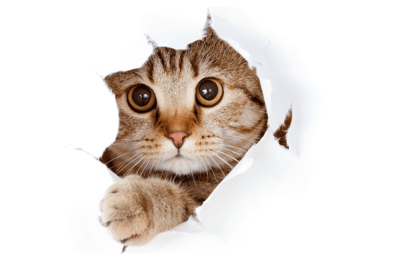
Curated Cat Beds: A special bed for a special cat.
Oregon Cat Stuff has connections in the cat industry. We are always on the lookout for crafters and makers that put the extra love into making a bed your cat will love. We curate a selection of beds from independent artists across the nation.
Single Card Module provides a mini card for especially drag and drop areas. Background image or only color can be set. It has a special hover effect. If desired, a logo or icon may be upload on top of the card. Also, there is a nice fade-up animation when scrolling.
Two-Column Image And Text Module
What is the purpose of the Two-Column Image-Text Module? This module provides two columns view, having content on the left, the image on the right, CTA, or Link on the bottom. If desired, columns can be reversed.
Two-Column Image And Text Module
What is the purpose of the Two-Column Image-Text Module? This module provides two columns view, having content on the left, the image on the right, CTA, or Link on the bottom. If desired, columns can be reversed.
Single Card Module provides a mini card for especially drag and drop areas. Background image or only color can be set. It has a special hover effect. If desired, a logo or icon may be upload on top of the card. Also, there is a nice fade-up animation when scrolling.
Gallery View Module consists of full images. Provides 3 different structures having the main part ( top wide image ), two-column part ( bottom ), and side ( right ) part. Also if any text is written on an image, the overlay is automatically enabled and overlay color can be changed. If desired, CTA or extra images can be added. The new zoom-in feature enables a bigger view with a pop-up.
Feature Box View Title
It is a slider with a special hover effect ( gets vertically bigger with a nice animation ) having three columns view. Each column has two parts as an image on the top and content on the bottom. If desired, CTA or Link can be added, and also it can be increased the number of extra slides.
Theme DeLight
Content Banner
Content Banner is a banner having an image or logo on the top, text on the middle, and bottom on the link or CTA. Generally, it uses impressive background images and a full-width feature. It has also a parallax scrolling effect.
